




In the digital landscape of 2024, the difference between a successful product and a forgotten one often boils down to a single factor: the quality of the user experience. If you are looking for practical tips UI UX professionals use to create seamless digital journeys, you have come to the right place. Designing a website or app isn’t just about making things look “pretty”; it’s about solving problems and making technology feel invisible. 88% of online consumers are less likely to return to a site after a bad experience, which makes mastering these principles critical for any brand’s survival.
Table of Contents
- The Foundation: Understanding the Difference Between UI and UX
- 1. Prioritize User Research and Empathy
- 2. Maintain Visual and Functional Consistency
- 3. Establish a Clear Visual Hierarchy
- 4. Design for Accessibility (A11y)
- 5. Embrace a Mobile-First Mentality
- 6. Use Whitespace Strategically
- 7. Simplify Navigation Structures
- 8. Optimize for Performance and Loading Speed
- 9. Implement Clear Feedback Loops
- 10. Leverage the Power of Micro-interactions
- 11. Focus on Clear UX Writing
- 12. Focus on Error Prevention, Not Just Correction
- 13. Design for Scanning, Not Just Reading
- 14. Master Color Theory and Typography
- 15. Test, Iterate, and Repeat
- Download Our Ultimate UI/UX Checklist
- Conclusion: Your Journey to Design Excellence
The Foundation: Understanding the Difference Between UI and UX
Before diving into specific tips UI UX experts recommend, it is essential to distinguish between the two disciplines. User Interface (UI) refers to the visual elements—the buttons, icons, spacing, and responsive color palettes that a user interacts with. User Experience (UX), on the other hand, is the internal feeling a user has while interacting with those elements. It covers the logic, the architecture, and the emotional response of the journey.
High-quality design requires a marriage of both. A beautiful interface (UI) cannot save a confusing layout (UX), and a functional workflow (UX) will fail if users cannot find the buttons (UI). As we explore these tips, keep in mind that the best designs are those where form and function work in total harmony.
1. Prioritize User Research and Empathy
One of the most valuable tips UI UX designers can follow is to never assume what the user wants. Empathy is the cornerstone of great design. You must step outside your own biases and understand the real challenges your target audience faces.
Start by creating user personas based on actual data rather than guesswork. Conduct interviews, distribute surveys, and observe how people use existing products. When you understand the “why” behind a user’s behavior, the “what” of your design becomes much clearer. Remember, you are not the user.
2. Maintain Visual and Functional Consistency
Consistency breeds familiarity, and familiarity breeds trust. If a “Submit” button looks like a pill-shaped blue element on your homepage, it should not look like a square red ghost button on your contact page. Inconsistent design forces users to relearn your interface at every step, increasing cognitive load.
Why Consistency Matters
- Predictability: Users feel in control when they can predict what an action will do.
- Efficiency: Elements that behave consistently across the platform allow users to complete tasks faster.
- Brand Identity: A cohesive look reinforces your brand’s professional image.
3. Establish a Clear Visual Hierarchy
Not all information on a screen is created equal. A successful layout guides the eye toward the most important elements first. This is known as visual hierarchy. You can achieve this through varied sizes, bold colors, and strategic placement.
Modern tips UI UX workflows often utilize the “F-pattern” or “Z-pattern” for scanning. For text-heavy pages, users tend to read in an F-shape, while for landing pages with less text, a Z-pattern is more common. Use larger headings (H2, H3) to break up content and use bold text to highlight key takeaways.
4. Design for Accessibility (A11y)
Inclusive design is not just a trend; it is a necessity. Designing for accessibility ensures that people with disabilities—such as visual impairments, hearing loss, or motor challenges—can still use your product effectively. This is a core pillar of modern ethical tips UI UX standards.
“The power of the Web is in its universality. Access by everyone regardless of disability is an essential aspect.” — Tim Berners-Lee, Inventor of the World Wide Web.
Ensure your color contrast ratios meet WCAG (Web Content Accessibility Guidelines) standards. Use descriptive alt text for images and ensure that your site is fully navigable via keyboard commands.
5. Embrace a Mobile-First Mentality
With over 50% of global web traffic originating from mobile devices, you cannot afford to treat mobile design as an afterthought. Mobile-first design involves designing for the smallest screen first and then scaling up for tablets and desktops.
This approach forces you to prioritize the most essential content and features because screens are small and attention spans are shorter. Ensure that touch targets (buttons and links) are large enough to be easily tapped with a thumb—specifically, at least 44×44 pixels.
6. Use Whitespace Strategically
Whitespace (or negative space) is the empty area between elements in a design. Beginners often try to fill every pixel of a screen, but pro tips UI UX veterans know that whitespace is a functional tool. It helps reduce clutter, increases readability, and allows the user’s eyes to rest.
Proper use of whitespace can draw attention to your Call to Action (CTA) buttons and separate distinct sections of content, making the overall experience feel more premium and thoughtful.
7. Simplify Navigation Structures
If a user can’t find it, it doesn’t exist. Effective navigation should be intuitive and require minimal clicks. Avoid over-complicating menus with too many levels or hidden dropdowns that are difficult to trigger on mobile.
Consider using breadcrumbs for deep site architectures and ensure the “Search” function is prominent if you have a content-heavy site. The “Three-Click Rule”—suggesting a user should find any piece of information within three clicks—is a great benchmark to aim for.
8. Optimize for Performance and Loading Speed
UX is not just about how it looks, but how it *feels*. A slow-loading site is a major UX failure. Even a one-second delay in page load time can result in a 7% reduction in conversions. Modern tips UI UX best practices involve optimizing image sizes, minifying code, and using Content Delivery Networks (CDNs).
Keep your animations lightweight and consider using “skeleton screens” to give the illusion of speed while content is loading in the background.
9. Implement Clear Feedback Loops
When a user performs an action, they need to know it was successful. Feedback loops are the system’s way of communicating with the user. If they click a button, does it change color? If they submit a form, does a success message appear?
Without clear feedback, users may become frustrated, clicking the same button multiple times or assuming the site is broken. Use animations, vibration (on mobile), or simple status messages to acknowledge every interaction.
10. Leverage the Power of Micro-interactions
Micro-interactions are small, subtle animations or design moments that happen during a specific task. Think of the “Like” animation on Twitter, a progress bar while uploading a file, or even the sound a phone makes when it unlocks. These details provide delight and personality to the interface.
When implementing these tips UI UX designers should be careful not to overdo it. Micro-interactions should enhance the experience, not distract from it. They should feel natural and purposeful.
11. Focus on Clear UX Writing
Words are a major part of the interface. UX writing involves crafting the copy found on buttons, error messages, and menu labels. Avoid using industry jargon or “robotic” language. Instead, use clear, conversational, and action-oriented labels.
Instead of a button that says “Submit,” try “Join the Community” or “Get Started Today.” Good UX copy reduces friction and guides the user toward the next step in their journey.
12. Focus on Error Prevention, Not Just Correction
While having helpful error messages is important, the best design prevents the error from happening in the first place. For example, if a password requires a special character, tell the user *before* they hit submit, not after they fail.
Use constraints to your advantage. If a user needs to pick a date in the future, disable the past dates on the calendar. This reduces the cognitive effort required and creates a smoother, more “foolproof” experience.
13. Design for Scanning, Not Just Reading
Users rarely read every word on a screen. Instead, they scan for keywords and visual cues. To accommodate this behavior, use:
- Bullet points: Like this list!
- Short paragraphs: No more than 2-3 sentences.
- Strong bolding: To highlight essential information.
- Descriptive headers: That tell the story of the page on their own.
14. Master Color Theory and Typography
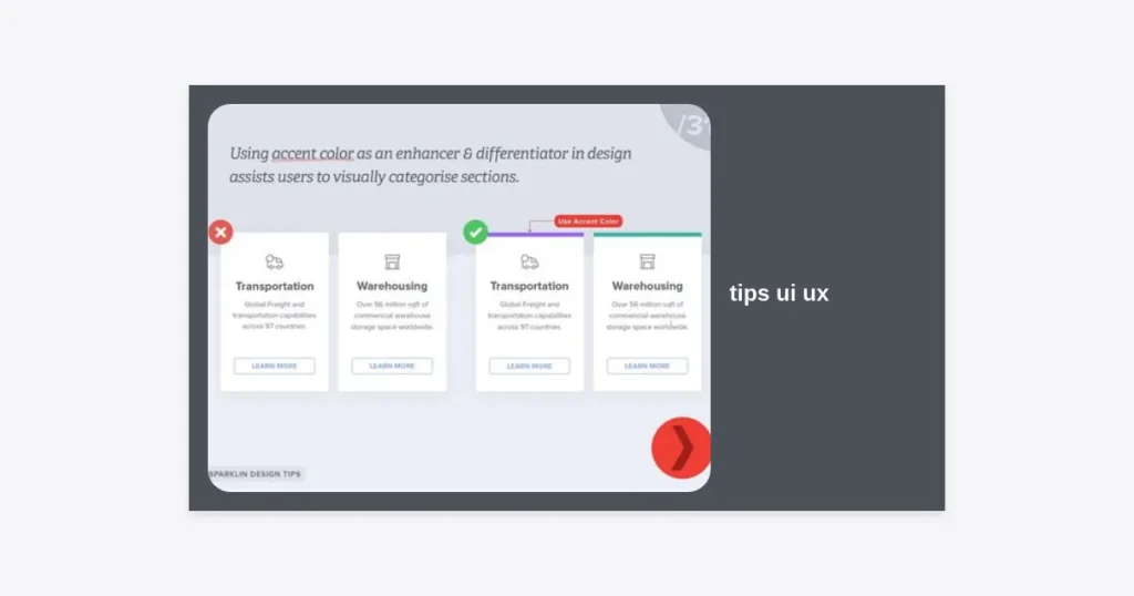
Color and typography are the “clothes” of your design. They communicate brand values and set the tone. Use color to create emphasis—for example, a bright color for a primary CTA and a neutral color for secondary actions.
For typography, ensure your font choices are legible across all screen sizes. Pairing a serif font for headings with a sans-serif font for body text is a classic way to create contrast. Pay close attention to line height (leading) and letter spacing (kerning) to ensure high readability.
15. Test, Iterate, and Repeat
The design process is never truly “finished.” The most critical of all tips UI UX professionals follow is the cycle of testing and iteration. Use A/B testing to compare two different versions of a page to see which one performs better.
Utilize tools like heatmaps (Hotjar) or session recordings to see where users are getting stuck. Data-informed design decisions will always outperform aesthetic ones in the long run. Continually refine your product based on user feedback and changing market trends.
Download Our Ultimate UI/UX Checklist
Ready to put these tips UI UX strategies into practice? We have created a comprehensive, 50-point checklist to help you audit your own designs for usability, accessibility, and visual appeal.
(Note: This is a placeholder link for the purpose of this guide.)
Conclusion: Your Journey to Design Excellence
Mastering UI and UX design is a journey, not a destination. By focusing on the user, maintaining consistency, and embracing accessibility, you set the foundation for digital products that people don’t just use, but love. These tips UI UX specialists use are intended to give you a roadmap, but the most important thing you can do is stay curious and keep learning.
Key Takeaways:
- Always start with user research.
- Prioritize accessibility and mobile-first responsiveness.
- Use whitespace and hierarchy to guide the user’s eye.
- Never stop testing and iterating based on real-world data.
By implementing these strategies, you’re well on your way to creating designs that stand out in a crowded marketplace and provide genuine value to your users. Happy designing!